Unstoppable was built around the idea of constant motion. At the heart of the campaign is the 3D round, the master brand device that represents momentum and connection. It became the anchor for the visual identity, a symbol of energy that never slows and a reminder that progress has no end point.
From this idea, the campaign expands into moments that highlight the athletes themselves. Each image captures them in their element, mid-stride or mid-thought, in that split second of pushing beyond what’s expected. These visuals are paired with short, powerful copy lines written as inner monologues. Together they reveal the mindset behind performance and the resilience that ties every athlete to the next.
The creative direction focuses on honesty and strength. Clean typography, authentic imagery and a restrained colour palette keep the attention on the athletes’ emotion and intent. Every design decision reflects movement, endurance and unity.
Unstoppable is more than a campaign. It’s a portrait of what it means to keep going when things get hard. A reflection of the spirit that runs through every athlete who wears green and gold, and a reminder that being unstoppable isn’t about perfection. It’s about never standing still.
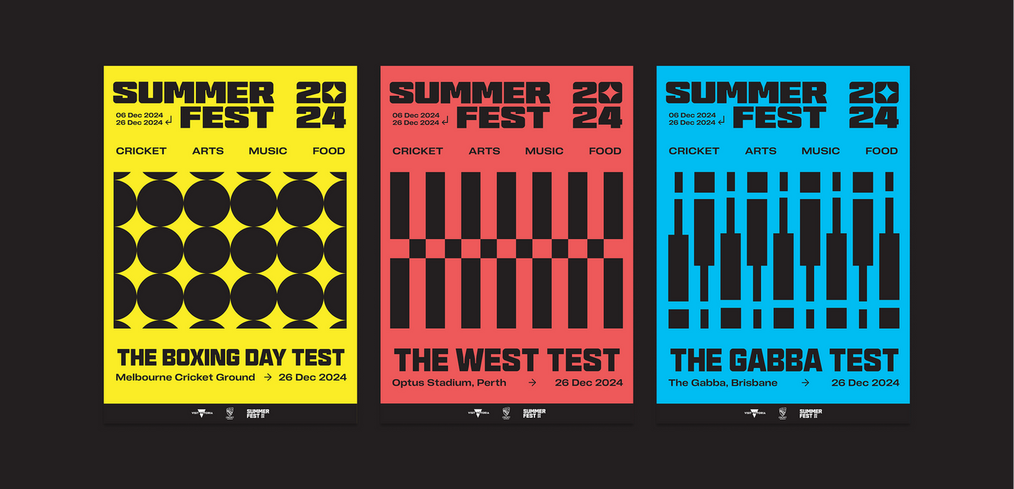
Summer Fest was developed to enhance the match-day experience, transforming the areas outside stadiums in Melbourne, Perth and Brisbane into vibrant fan festivals. The creative direction celebrates the energy of summer and the culture of cricket through bold, design-led storytelling.
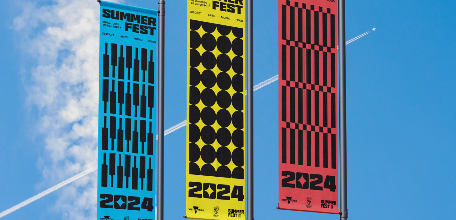
Inspired by Swiss and Bauhaus design principles, the visual identity uses clean geometry and structure to build recognisable yet versatile brand patterns. The system draws on cricket’s key elements, including wickets, a set of six balls representing an over, and a bat. These simple shapes capture the essence of the sport while remaining abstract and adaptable across different applications.
From this framework, the six-ball motif evolved into a star icon that anchors the logo and acts as a unifying device across image containers, social applications and festival branding. Moving away from traditional Cricket Australia colours, the palette introduces a fresh, contemporary look while retaining brand familiarity. Bold typography adds strength and clarity, reinforcing the festival’s confident tone of voice.
Given limited imagery, an illustrative, vector-based approach allowed the creative to scale across large-format and digital applications, establishing a dynamic and engaging visual experience that connects fans to the spirit of cricket.
Summer Fest
Cricket Australia – Festival Brand – 2024


